How to Make a Glitch Carousel Cover for Instagram Posts
If your glitch carousel cover looks striking on your desktop monitor but turns into an illegible, muddy blur once uploaded to Instagram, you are running into the platform's compression and contrast limits. Glitching an Instagram carousel cover requires a distinct balance between destructive distortion and graphic legibility.
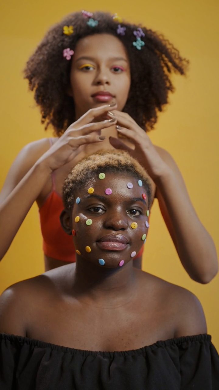 BEFORE
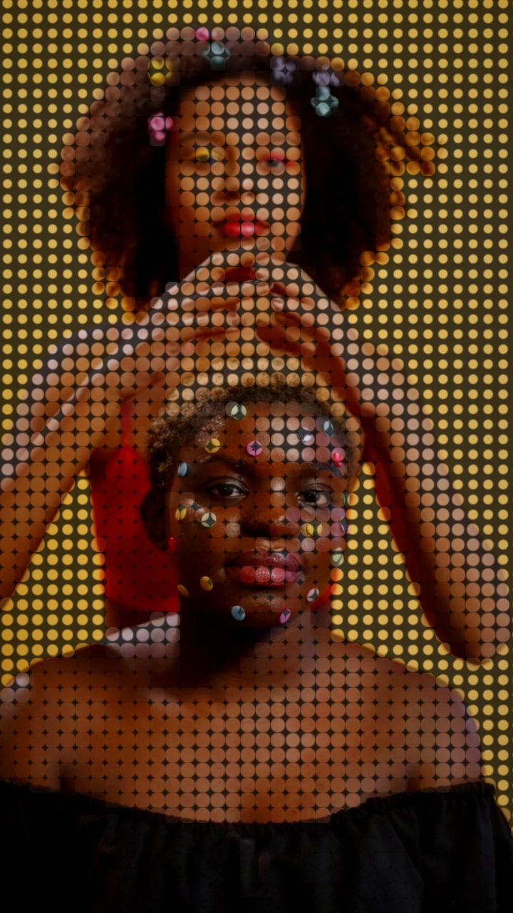 AFTER
AFTERThe Core Problem: Why Glitch Carousel Covers Fall Apart in the Feed
Instagram carousels live or die on the first slide. When users scroll quickly through their feed, micro-details like fine scanlines or subtle analog noise are often crushed by mobile compression algorithms. Worse, chaotic pixel tearing over text makes headlines unreadable, destroying swipe-through rates.
A successful glitch carousel cover needs three things: high localized contrast, structured textural distortion rather than random mush, and a clear focal point. Instead of layering heavy analog noise that smears your subject, starting with a print-inspired digital breakdown gives you crisp lines that survive compression.
The Fix: Start with the Comic Preset
The fastest way to achieve a structured, punchy look is by applying the Comic preset inside the editor. Unlike purely chaotic distortions, the Comic preset translates visual information into bold halftone dots, saturated color shifts, and distinct edge thresholds.
This aesthetic creates instant visual punch because it introduces texture without sacrificing the underlying shapes of your cover photo or typography. Here is how to fine-tune the preset to fit your slide layout:
- Halftone (dots) & Dot Size: If your cover art includes fine lettering or small logos, nudge the dot size down so the dot grid does not break your letterforms. For abstract photography or bold portraits, increasing dot size creates a distinct pop-art grit.
- Contrast & Color Boost: Instagram's dark and light modes both demand clear luminance separation. Nudge Color Boost upward if your cover feels flat, ensuring vibrant primary tones cut through the feed.
- Dot Flatten: Adjust this knob to taste depending on whether you want your image to feel like an ink-printed comic page or a digitized retro display.
Step-by-Step: Building a Clean Glitch Carousel Cover
- Import your base graphic: Open Glitchest in your browser and drag your 1:1 square or 4:5 vertical artwork directly onto the canvas. Because Glitchest processes media entirely in-browser, there is no file upload wait or account sign-up.
- Apply the Comic starting point: Select the Comic preset from the library to establish high-contrast halftone separation.
- Mask sensitive focal points (Optional): If your title typography or subject's face is getting overwhelmed by the effect, enable rectangle or ellipse masking. Position the mask over the background so the glitch frames the focal point while keeping critical text sharp. Check out our guide on how to glitch a photo for deeper masking workflows.
- Layer timeline accents for animated covers: If you are creating a video cover slide (MP4), drop an effect box onto an upper lane of the timeline for a brief duration to create a sharp burst of distortion. Adjust the box fade-in and fade-out handles to control how quickly the glitch hits and releases.
- Export high-resolution assets: If publishing a static slide, click Save Frame to export an uncompressed PNG directly to your device. If you built a motion cover, export the finished clip as an MP4 via WebCodecs.
Troubleshooting Common Cover Mistakes
Text Becomes Unreadable
If viewers cannot read the topic of your carousel, they will not swipe. If you do not want to use masking, decrease the dot matrix intensity and increase contrast so that the threshold between your typography and background stays razor-sharp.
The Glitch Looks Too Washed Out
Avoid relying solely on light-gray static or soft digital haze. Glitch art thrives on punchy black levels and vivid chromatic separation. Increasing your contrast knob grounds the darker areas of the image, allowing bright glitch accents to pop on mobile displays.
The exact settings
Start from the Comic preset, then set:
| Color Boost | 44 |
| Contrast | 64 |
| Halftone (dots) | 72 |
| Dot Size | 56 |
| Dot Flatten | 44 |
Everything else stays at its default — tweak it, then copy your own look as JSON or a link from inside the editor to share it.
Try it now — add this look to your own clip, free and in your browser.
Open the editor →FAQ
Why does my glitch carousel cover look blurry when uploaded to Instagram?
Instagram applies aggressive compression to feed images, turning fine pixel noise into muddy artifacts. Using structured halftone dots and boosted contrast preserves clean edge definition across mobile screens.
Can I make an animated glitch cover for a carousel slide?
Yes, you can drop your image into the timeline, add short effect boxes to create a punchy glitch stutter, and export as an MP4 loop or capture a still with Save Frame.
How do I keep my title text readable through heavy glitch effects?
Use Glitchest's built-in rectangle or ellipse masking to isolate and protect your headline text layer, or lower the dot flatten and dot size knobs to maintain letter clarity.