Chunky Poster Art: Fix Posterize, Retro Palette & Dither
When you try to combine posterization, a restricted retro palette, and pixel dithering for a stylized poster frame, the result often turns into a muddy, washed-out smear instead of high-contrast graphic art. Here is why that color crunch collapses and how to fix your pipeline instantly.
 BEFORE
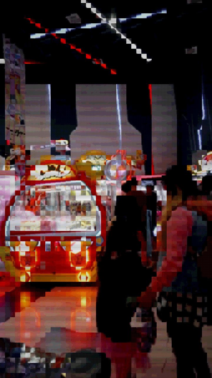 AFTER
AFTERWhy Dither and Posterization Turn into Pixel Mud
The aesthetic goal of a chunky poster-art frame is crisp, stepped color reduction reminiscent of early desktop publishing, risograph printing, or 8-bit game title cards. However, beginners frequently run into three compounding problems when trying to build this look manually:
- Midtone Smearing: Standard video frames have broad 8-bit or 10-bit color gradients. When a dithering algorithm attempts to resolve subtle gradients without high underlying contrast, it scatters tiny single-pixel dots across the entire frame, creating visual noise instead of distinct tonal blocks.
- Washed-Out Palettes: Clamping a standard color space to a restricted retro palette without increasing saturation first forces bold primaries into dull, desaturated approximations.
- Resolution Mismatch: If the pixel resolution is kept too fine, the dither matrix reads like digital sensor noise rather than deliberate, chunky print halftone.
The Solution: The Retro Game Preset Starting Point
To produce defined, chunky poster frames, you need a preset structure that aggressively drives contrast, saturates base values, and locks colors into a quantized step matrix. In the editor, the Retro Game preset serves as the ideal baseline for this workflow.
The Retro Game preset groups the exact parameters required for graphic reduction. Instead of scattering noisy dither patterns over weak gray tones, it pushes luminance boundaries so that shadows clamp hard to deep tones, midtones break into distinct steps, and highlights punch through. By anchoring your grade on this preset, you eliminate the flat, hazy look that usually plagues browser-based palette reduction.
How to Dial in the Chunky Poster-Art Look
- Import your media: Drop your video clip or still image directly into Glitchest. Everything runs locally in your browser with zero file uploads.
- Apply the Retro Game preset: Select the preset from the library dropdown to establish the high-contrast color step baseline.
- Nudge Contrast and Color Boost: Push Contrast upward to force smooth skin tones or gradients into sharp, distinct posterized islands. Increase Color Boost to ensure the limited palette locks into vibrant hues rather than muddy grays.
- Tune Pixelate and Retro Palette: Adjust the Pixelate slider until the dither matrix groups into visible, chunky blocks. Increase the Retro Palette strength to clamp the color count down to iconic, retro-arcade levels.
- Zero Out CRT Scanlines (Optional): The Retro Game preset includes subtle horizontal scanlines suited for CRT displays. If you want a clean, physical screen-print or poster-card look, drag the Scanlines slider down so the pure geometric dither stands out.
- Export your asset: Click Save Frame for an instant, uncompressed PNG still frame, or export the animated sequence directly as an MP4 via WebCodecs.
Isolating Poster Effects with Effect Boxes and Masks
You do not always want heavy posterization covering every inch of your composition. If small text or fine facial details become illegible under heavy pixel stepping, use Glitchest's effect-box timeline and masking tools to control the application.
Drop an effect box onto your clip along the timeline to trigger the chunky poster look during specific hits or transitions. You can set the box's fade-in and fade-out parameters to smoothly ramp the quantization in and out, or place a short box for a hard, single-frame poster flash. Layer multiple boxes across lanes to blend the dither with other processing styles, such as our retro game console look or textured halftone posterize techniques.
To protect key elements, switch on an ellipse or rectangle mask. Invert the mask so the center subject retains sharpness while the outer borders crunch into a bold, dithered graphic frame.
The exact settings
Start from the Retro Game preset, then set:
| Color Boost | 44 |
| Brightness | 54 |
| Contrast | 60 |
| Scanlines | 26 |
| Pixelate | 62 |
| Retro Palette | 74 |
Everything else stays at its default — tweak it, then copy your own look as JSON or a link from inside the editor to share it.
Try it now — add this look to your own clip, free and in your browser.
Open the editor →FAQ
Why does my dithered image look like fuzzy noise instead of clean poster art?
Fuzzy dither happens when contrast is too low before color clamping, causing dithering algorithms to scatter random micro-pixels across smooth midtones instead of locking into defined graphic tone blocks.
Should I keep scanlines enabled for a print poster look?
If your goal is a physical risograph or screen-print poster aesthetic, dial scanlines down to zero so you retain pure pixel clusters and flat color posterization without CRT horizontal banding.
How do I export an ultra-crisp still frame without compression artifacts?
Use the Save Frame button in the editor toolbar to download an uncompressed PNG still directly from the WebCodecs canvas without video encoding loss.