Retro Handheld Look: Pea-Soup 2-Bit Palette Recipe
Channel early nineties handheld gaming with this crunchy, pea-soup olive aesthetic. By crushing your frame into coarse 2-bit steps and tinting the luminance range with murky moss tones, you evoke battery-drained LCDs, pocket gaming nostalgia, and late-night car rides under passing streetlights. It turns ordinary video into genuine dot-matrix artifacts instantly.
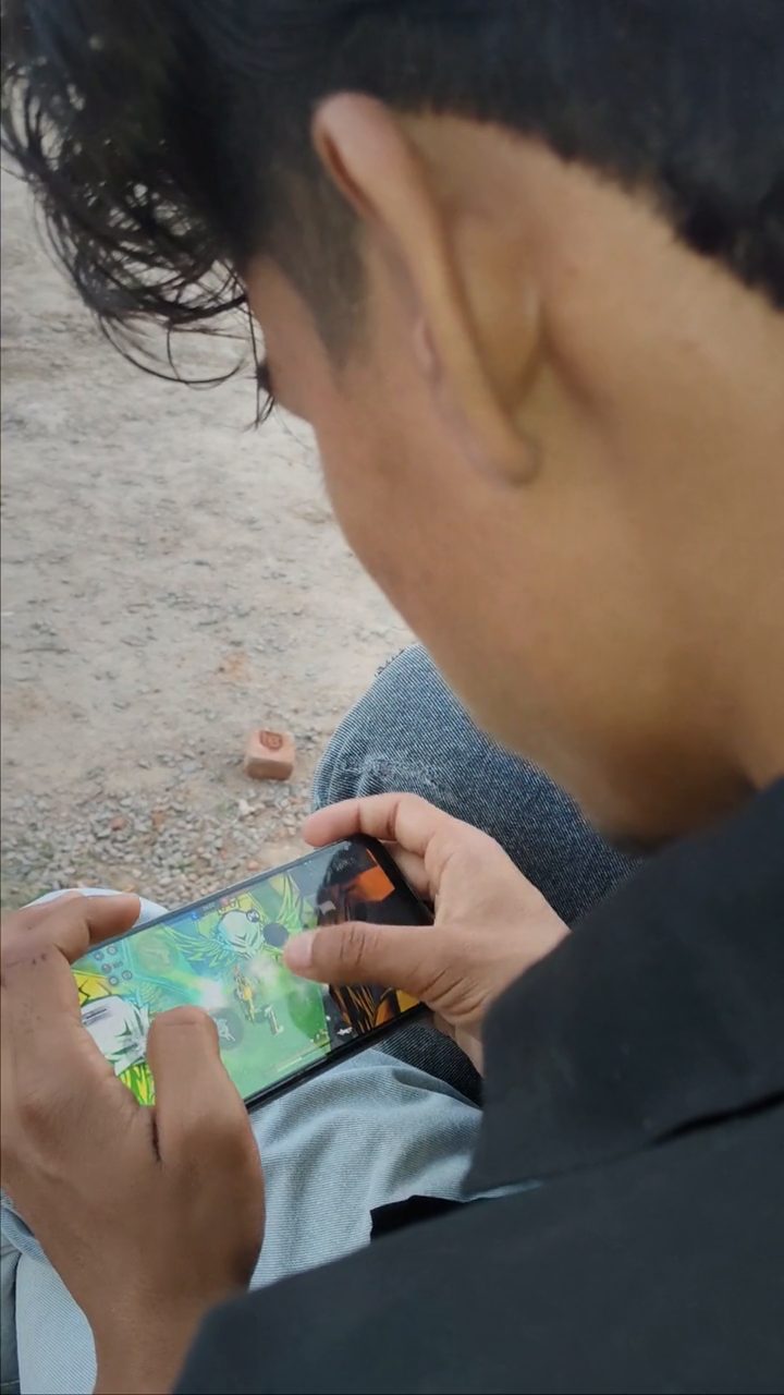 BEFORE
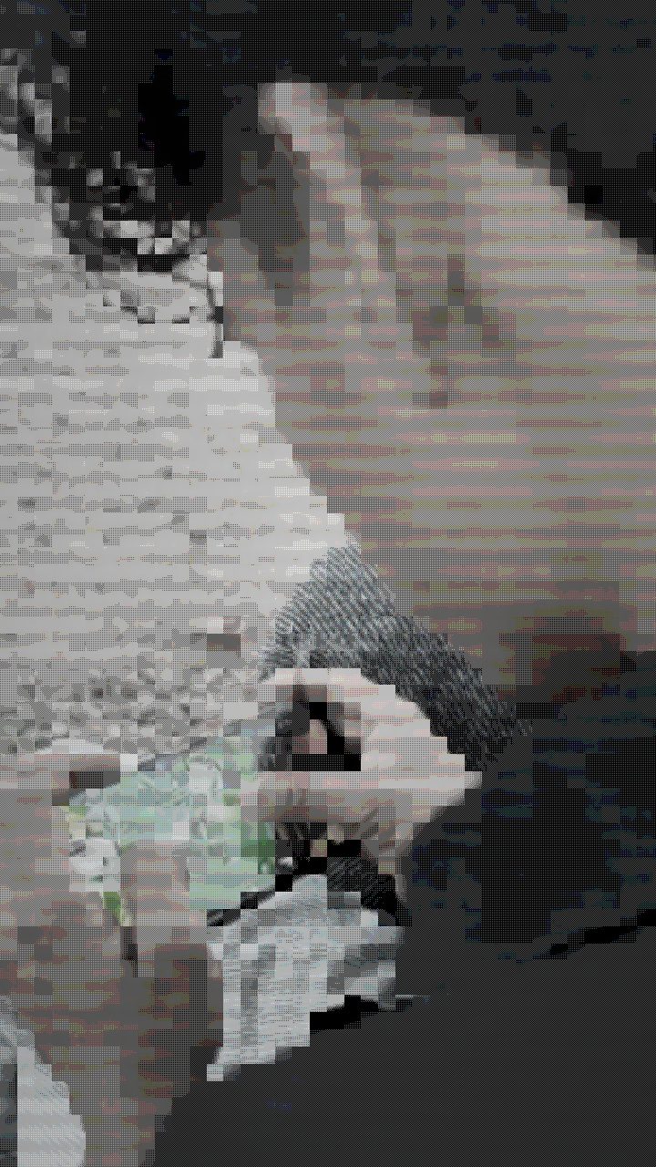 AFTER
AFTERWhy this look works
The core alchemy of this recipe relies on stripping native color information and forcefully remapping luminance values through a restricted green spectrum. Grayscale does the initial demolition work by killing modern color fidelity, while the retro palette dial compresses continuous tones into distinct graphic stepping reminiscent of monochrome liquid-crystal screens.
Balancing Pixel Chunks and Olive Tones
Pixelate acts as the mechanical engine here, grouping fine details into chunky, tactile blocks. If you set it too loose, the frame looks like modern video with a cheap wash; if you crank it too far, your subject dissolves into indistinguishable mosaic noise. Target color and color boost work as a pair to inject that unmistakable sickly olive hue into the highlights without blowing out shadow details.
A light touch of scanlines ties the entire stack together, simulating the faint horizontal grid lines found behind reflective LCD polarizers. Overcooking scanlines will darken the entire composite into an unreadable mess, but keeping them subdued introduces the tactile screen texture essential to this retro feeling.
The recipe
Start from the Retro Handheld preset, then set:
| Target Color | 34 |
| Color Boost | 50 |
| Contrast | 58 |
| Grayscale | 72 |
| Scanlines | 20 |
| Pixelate | 66 |
| Retro Palette | 84 |
Everything else stays at its default — tweak it, then copy your own look as JSON or a link from inside the editor to share it.
What footage suits it
Because this recipe reduces your visual information down to a handful of olive tonal bands, your source footage needs strong structural separation to survive the downsampling process:
- High-contrast lighting: Hard rims, directional sunlight, or deep shadows create defined boundaries that render crisply once quantised.
- Clean silhouettes and bold shapes: Bold character outlines, stark profiles, and readable gestures maintain readability even when reduced to tiny pixel blocks.
- Slow to moderate motion: Controlled movement prevents the coarse resolution grid from turning into unreadable digital noise.
Avoid flat, low-contrast scenes shot in overcast lighting, as they compress into a single muddy midtone.
Common mistakes
- The image turns into a solid green puddle: Your source lacks dynamic range. Fix this by driving contrast upward until highlights cleanly punch through the background shade.
- Details are completely illegible blobs: The mosaic blocks are too coarse for your composition. Back off pixelate until facial features and contours snap back into view.
- The frame looks like a standard black-and-white clip: The olive tone is not biting into the pixels. Elevate target color and color boost to inject the signature murky hue into the monochrome output.
When to use it
This distinct 2-bit treatment strips modern polish away, making it an extraordinary tool for lo-fi aesthetics across digital media:
- Lo-fi music loops and visualizers: Seamlessly match chiptune soundtracks, ambient synth jams, or downtempo beats.
- Retro gaming social cutscenes: Frame developer logs, fan art reels, or gameplay highlights inside an authentic pocket-screen window.
- Pixel-art avatar selfies: Turn ordinary mobile front-camera clips into nostalgic profile animations.
- Analog nostalgia edits: Infuse found footage or childhood home movies with a tactile electronic memory haze.
Load your clip into the editor to build this nostalgic stack in seconds. If you want to push the look further toward hard graphic dither, study our Retro Handheld Look: 2-Bit Dot-Matrix Palette Guide for alternate framing ideas.
Try it now — add this look to your own clip, free and in your browser.
Open the editor →FAQ
Why does my footage look like muddy gray mush instead of an authentic handheld screen?
You need stronger separation before the palette remap. Raise your contrast dial so the underlying shapes can slice cleanly across the olive tonal tiers instead of blending into the middle gray.
How do I make the dot-matrix grid look sharper on high-resolution video?
Nudge down the pixelate slider slightly so the screen grid holds defined micro-squares, and keep scanlines gentle so horizontal bars do not overwhelm the blocky matrix.
Can I get this monochrome pea-soup effect on colorful gaming captures?
Yes, the high grayscale value strips native saturation first, allowing the target tint and retro palette stages to remap your bright footage directly into olive-drab steps.